


Analytica House
Mar 26, 2023Website Design from an Analytics Perspective

A website’s UX compatibility and healthy analytics measurement require the site design and technical infrastructure to be structured according to the following points:
-
The GTM (Google Tag Manager) snippet must load before the dataLayer. This ensures that the data needed for analytics and tracking is collected and recorded correctly. If the GTM snippet loads after the dataLayer, it can lead to missing or inaccurate data. Therefore, loading GTM before the dataLayer is essential.
-
Technically, the page structure should not be a single-page application. Single-page sites often cause problems for Analytics measurement and GTM setups.
Single-Page; i.e., one-page websites that present all content on a single page. Users scroll or search within that single page to find the content they need.

Why Your Site Shouldn’t Be Single-Page
-
Content Density: If a site has a lot of content, cramming it all onto one page makes searching and scanning harder. Splitting content across multiple pages helps users find what they need more easily.
-
SEO Improvements: A multi-page structure allows unique meta tags, titles, and descriptions per page, making it easier for search engines to crawl and index each page.
-
Load Time: Too much content on one page slows down loading. Multiple pages reduce load time and improve user experience.
-
Management Ease: Managing and updating content is simpler when it’s organized across several pages rather than all on one.
-
Content Focus: Multi-page sites let you optimize each page for a single topic or purpose, making messaging clearer and helping users find relevant content.
Of course, every site has different needs, and some cases may suit a single-page design. But generally, multi-page sites organize content better, enhance UX, and are more SEO-friendly.
-
Follow Jakob’s Law in your site design to give users a familiar, efficient experience. Instead of reinventing the wheel, integrate standard interaction patterns and refine your design accordingly.
-
When positioning elements, remember user attention decreases from header to footer. Critical conversion-driving components should be placed where they will get the most visibility.
-
The menu should reflect a clear category hierarchy and serve users efficiently, in line with UX best practices.
A site’s category hierarchy organizes content and guides users to find what they need. It shows relationships between topics and improves navigation. For example, an e-commerce store uses nested product categories, while a news site groups articles by topic and subtopic.

Category hierarchies also help site search engines surface relevant results within a selected category, making content discovery easier.
-
Add a breadcrumb trail made of subcategories so both users and search engines can understand and navigate the site structure.
Breadcrumb is a navigation element that shows a page’s position within the site. It typically appears near the top of the page as a series of links like “Home > Section > Subsection”.

-
Pages should load ideally in under 2.5 seconds. Page speed is critical for Analytics and CRO, so optimize technically for fast performance.
-
Use the brand colors and typography defined in the brand book consistently across all elements.
-
Keep URLs as short and meaningful as possible. Append paths that follow the category hierarchy.
-
On an e-commerce site, structure the funnel so users start their conversion path as quickly as possible, offering a straightforward, fast, practical experience.
-
Optimize images: product image files should be under 100 KB to maintain speed. Banner sizes may vary. Also ensure filenames and alt text match the image and page content for better crawling.
-
Downloadable links (e.g., PDFs) should not open in a new page. Serve them directly so tracking treats them as downloads.
-
Avoid “ghost search” in-site search implementations. They hinder tracking and analysis of search terms.
Ghost Search automatically shows results before a user types in the search box. While meant to help discovery, it can surface irrelevant results and hurt performance. It’s better to implement a simple, user-friendly search that returns accurate results without extra resource usage.
-
Minimize click depth: users should reach content in as few clicks as possible (ideally 2–3). Deep hierarchies hurt UX; design to keep navigation shallow.
-
On an e-commerce site, prevent “dead clicks” by prompting users when they miss an action (e.g., “Add to cart” or login). This reduces drop-off and improves conversion rate.
-
Banner images linking to listing pages should include clickable links so users can initiate the conversion journey directly.
-
On product pages, add a related-products slider (“You might also like”) to increase engagement and conversion.
More resources

Detect Performance Drops Early with Anomaly Detection
In digital products, the most critical problems are often the ones noticed the latest. Traffic drops...
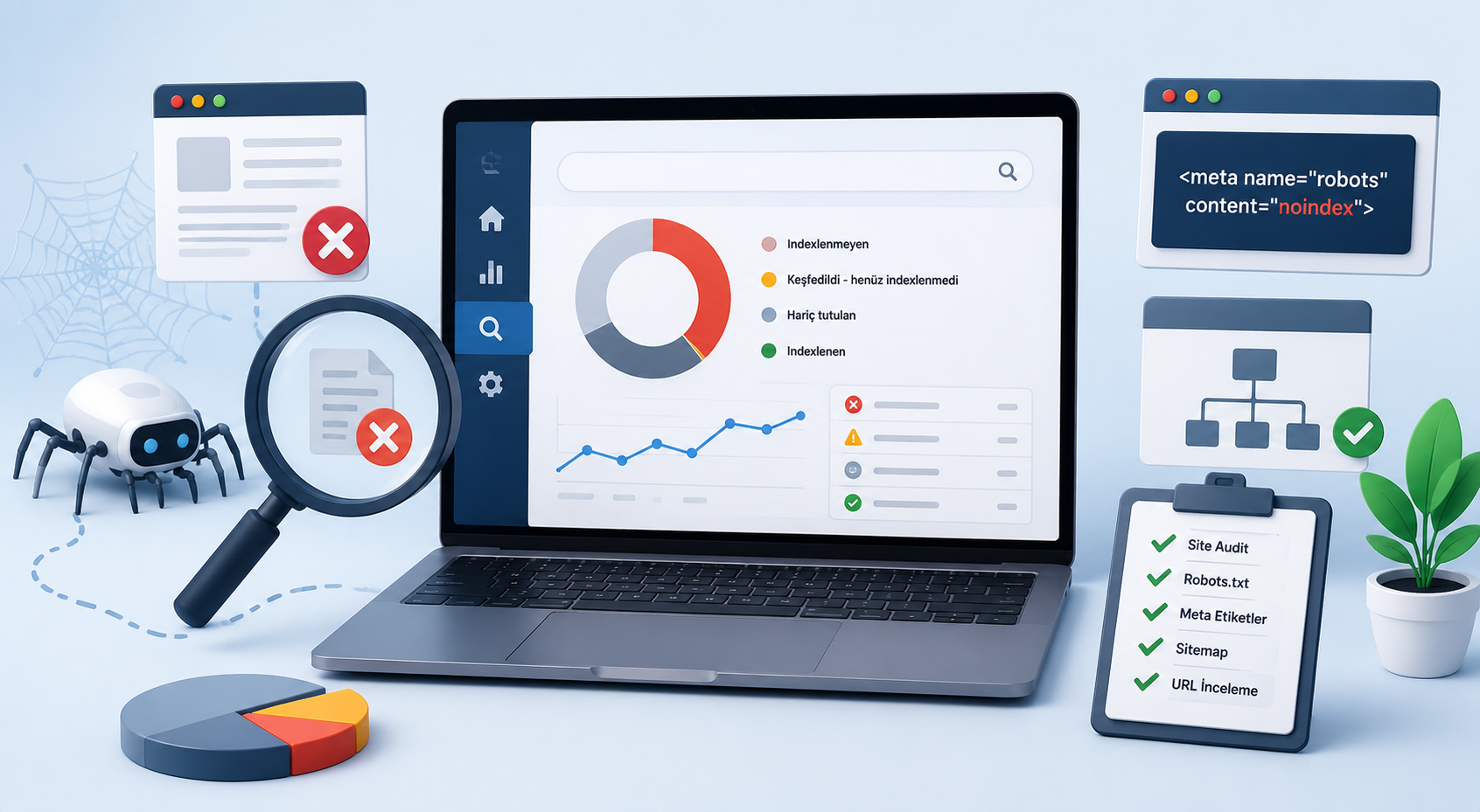
How to Identify Non-Indexed Pages?
If you manage a website or monitor SEO processes, you know that the foundation of your digital prese...
How Do 404, 410, and 401 Status Codes Affect SEO?
In the digital world, the technical health of your website is one of the most fundamental factors de...